For me the most annoying feature ever were "personalized menus" (you know, only the last recently used menus became visible, so you certainly wouldn't find what you were looking for). That one was introduced in, what was it, Office 2000? And don't let me start moaning about Clippy.
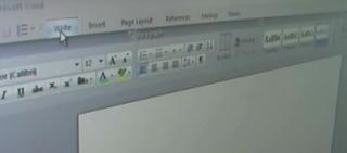
But from what I have seen, Office 12 will be a real step forward. It's a bit risky: just imagine the install base - millions and millions of secretaries who have been ill-conditioned over the last decade in order to find the 1% of overall functionality that they are actually using. But only the bold one wins! Don't let Apple take away all the user interface glory, Microsofties!
