
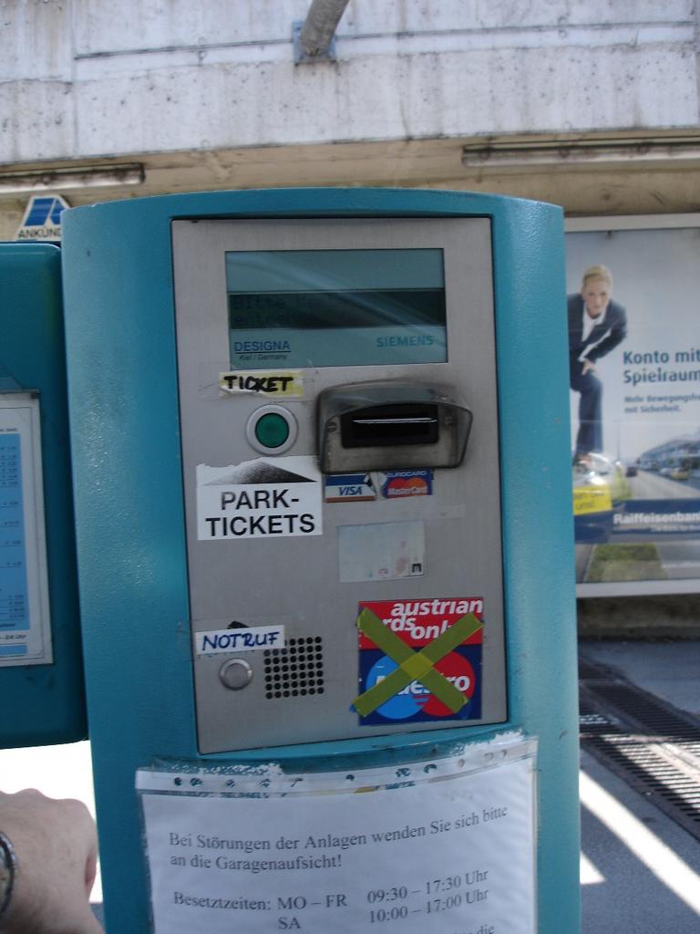
An unused display, several ugly stickers, partly crossed out, redundant labels and arrows, so that even after passing the garage entrance several times I still could not find the ticket button immediately. Regarding the emergency button (="Notruf" in German), I wonder which kind of emergency one might be facing at this point anyway (but maybe a nervous visual overload attack).
Why on earth, if all of that could be so easy:
| ||
|


BTW, this garage has additional bad user experience to offer (hint: calculator-like elevator button panel, so what about pressing "-" and "1" when going to the basement?) - more on that in one of my next postings.